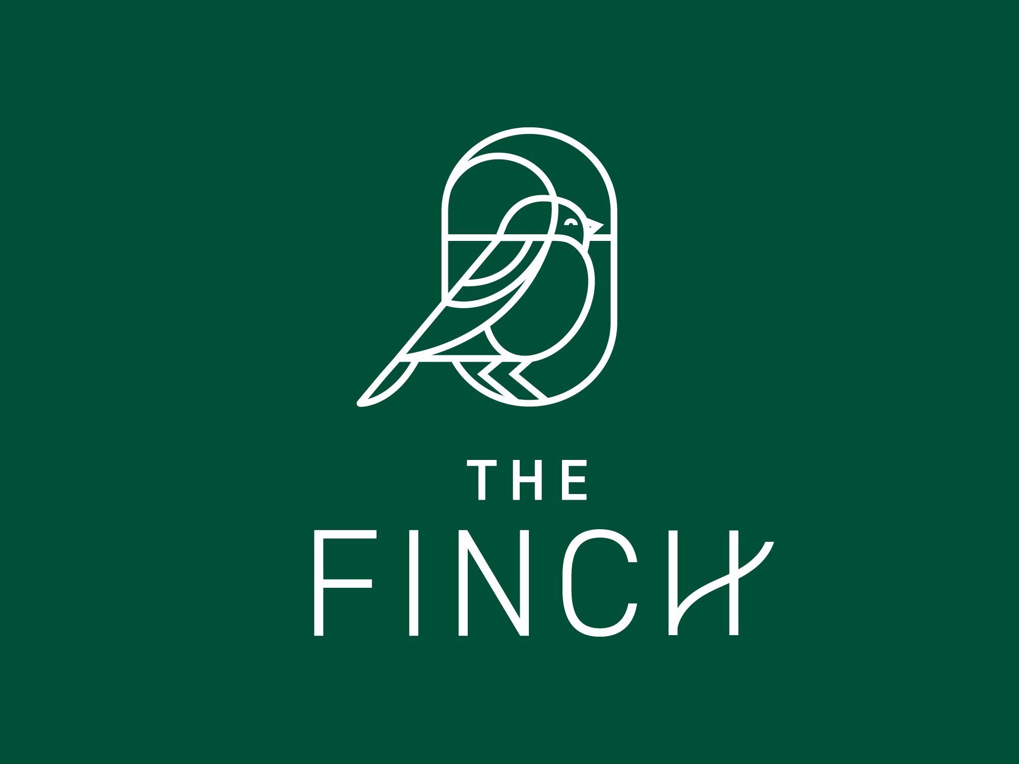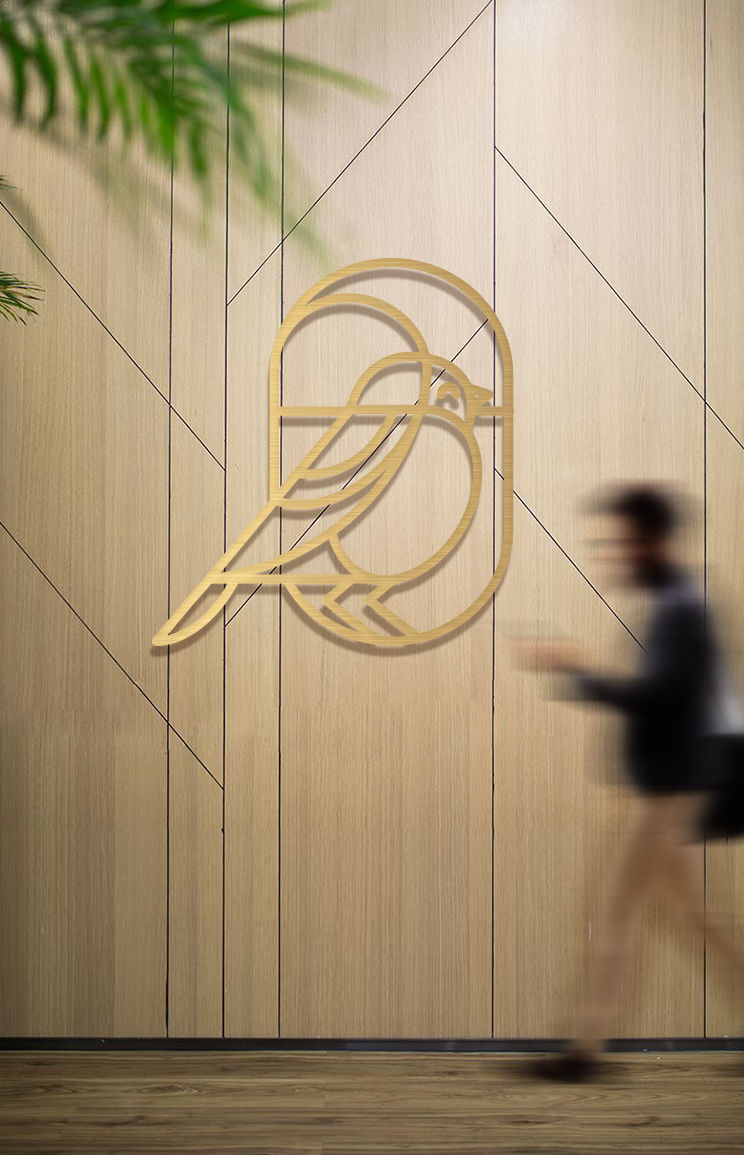
The Finch
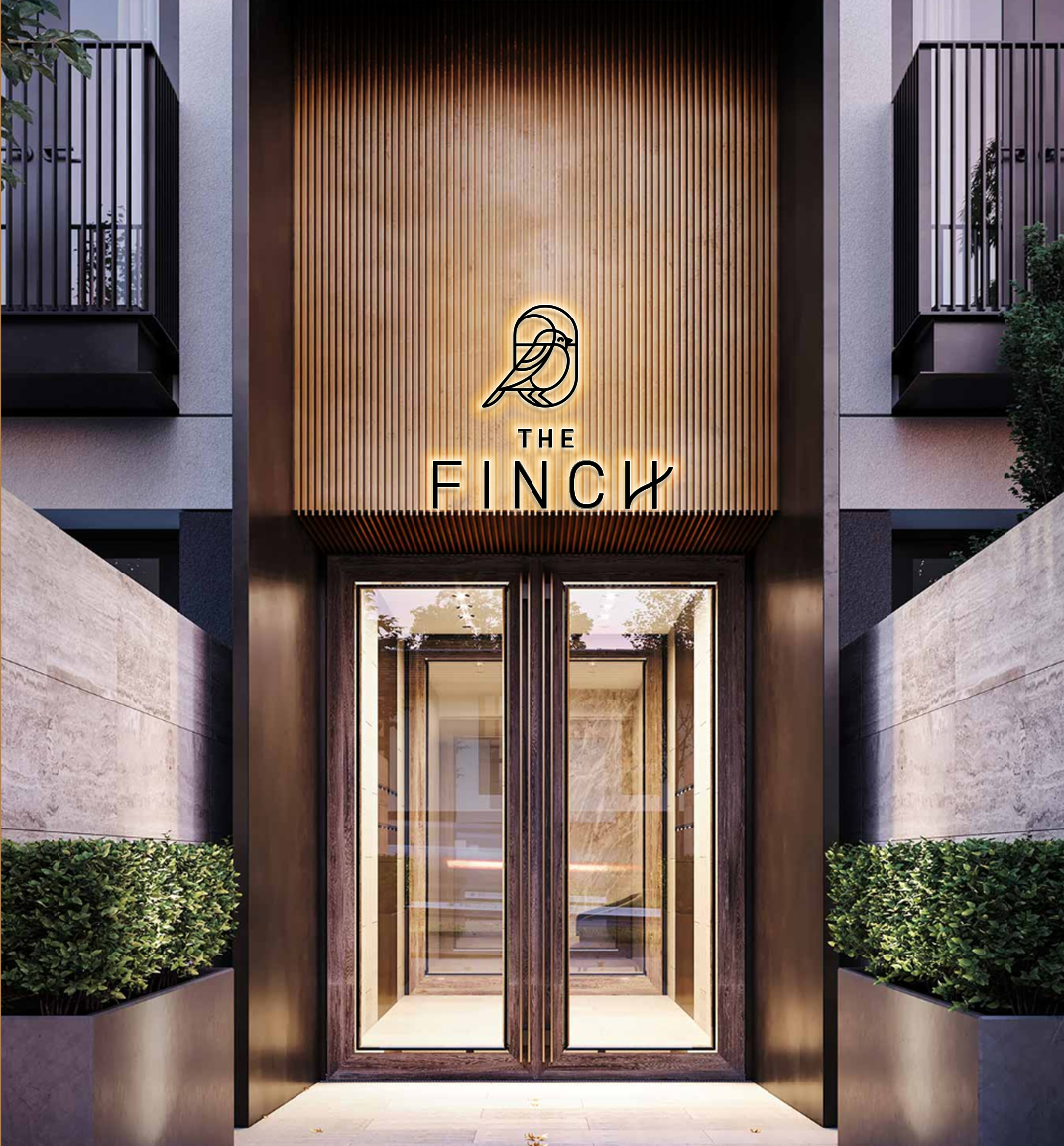
Wake up whistling in this new development currently under construction in Dartmouth.
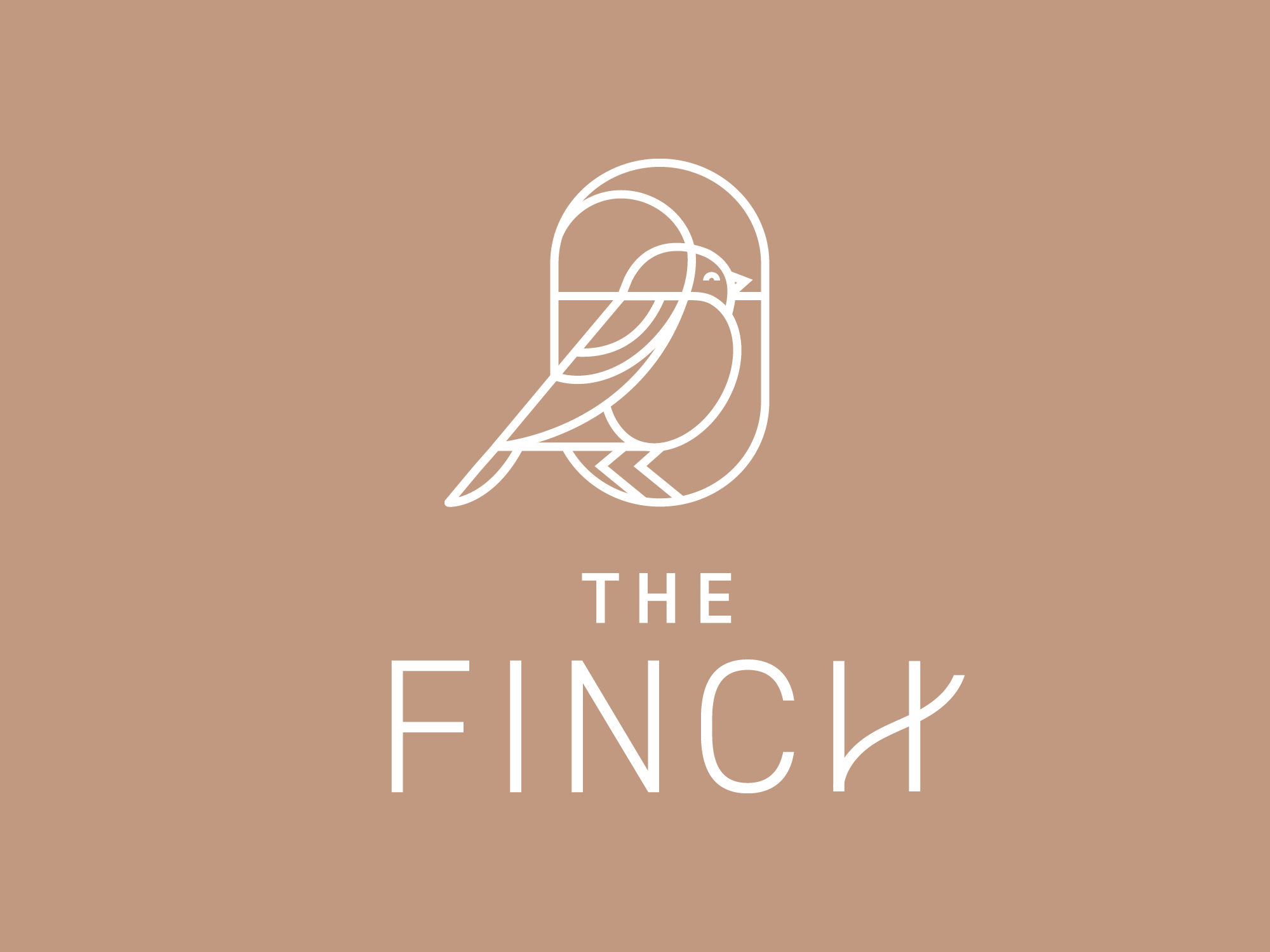
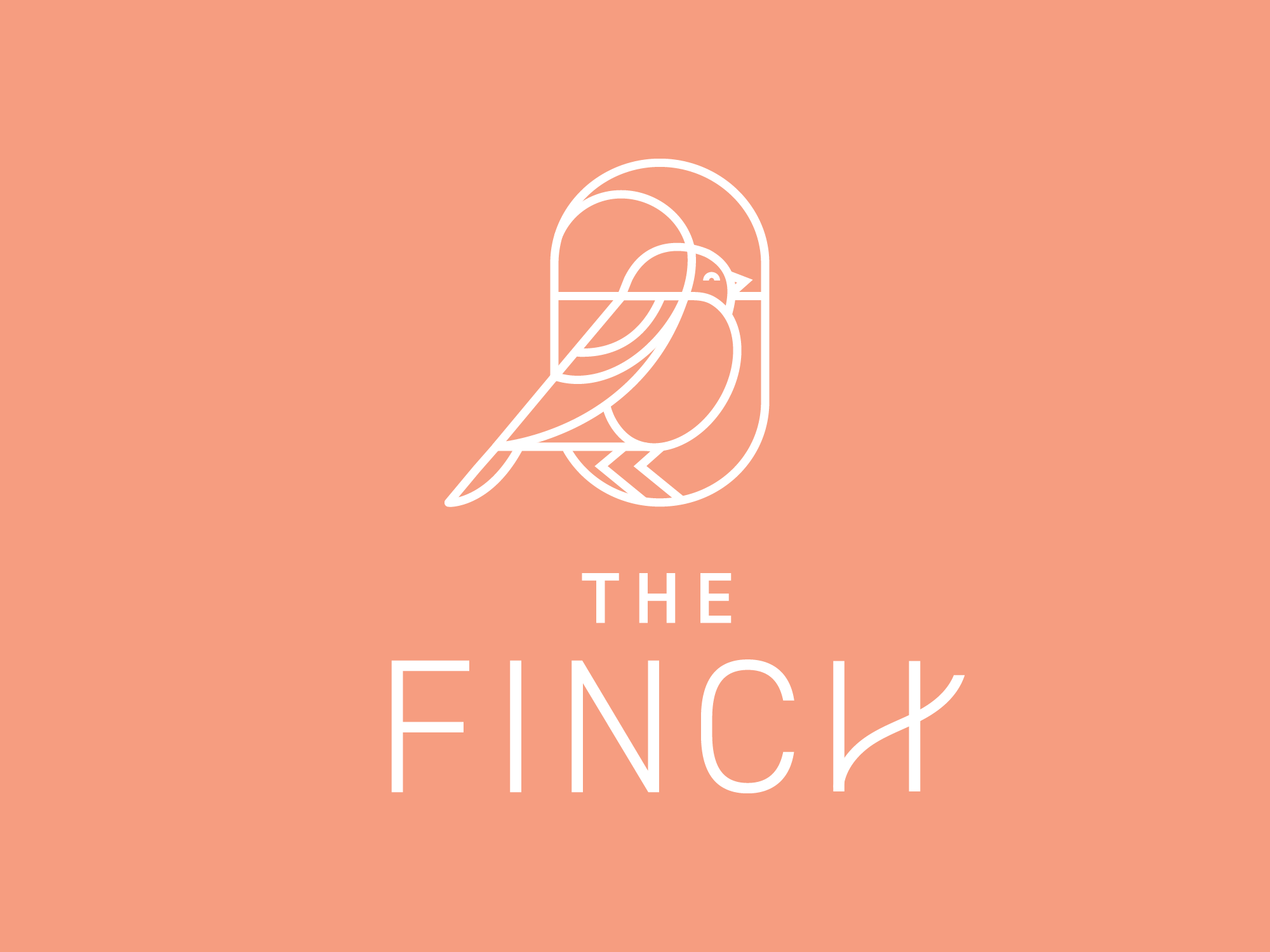
Delicate fine lines and a lightweight typeface give the brand a refined, elegant quality that reflects the name. A subtle flair on the “H” introduces an organic touch, reminiscent of a branch or a bird’s tail feather.
The colour palette has a natural feel inspired by the location’s close proximity to the small parks of Dartmouth, while the peach accent colour adds a pop of interest and evokes feelings of warmth and comfort.
The Finch is where nature, design, and modern living come together in perfect harmony.
SERVICES:
• Naming
• Brand Identity
• Brand Guidelines
• Brand Voice
• Copywriting
• Print + OOH
• Signage + Graphics