VillageWorks
VillageWorks, Halifax’s hip audio and post-production studio, called on us to craft a fresh brand that vibes with their new space.
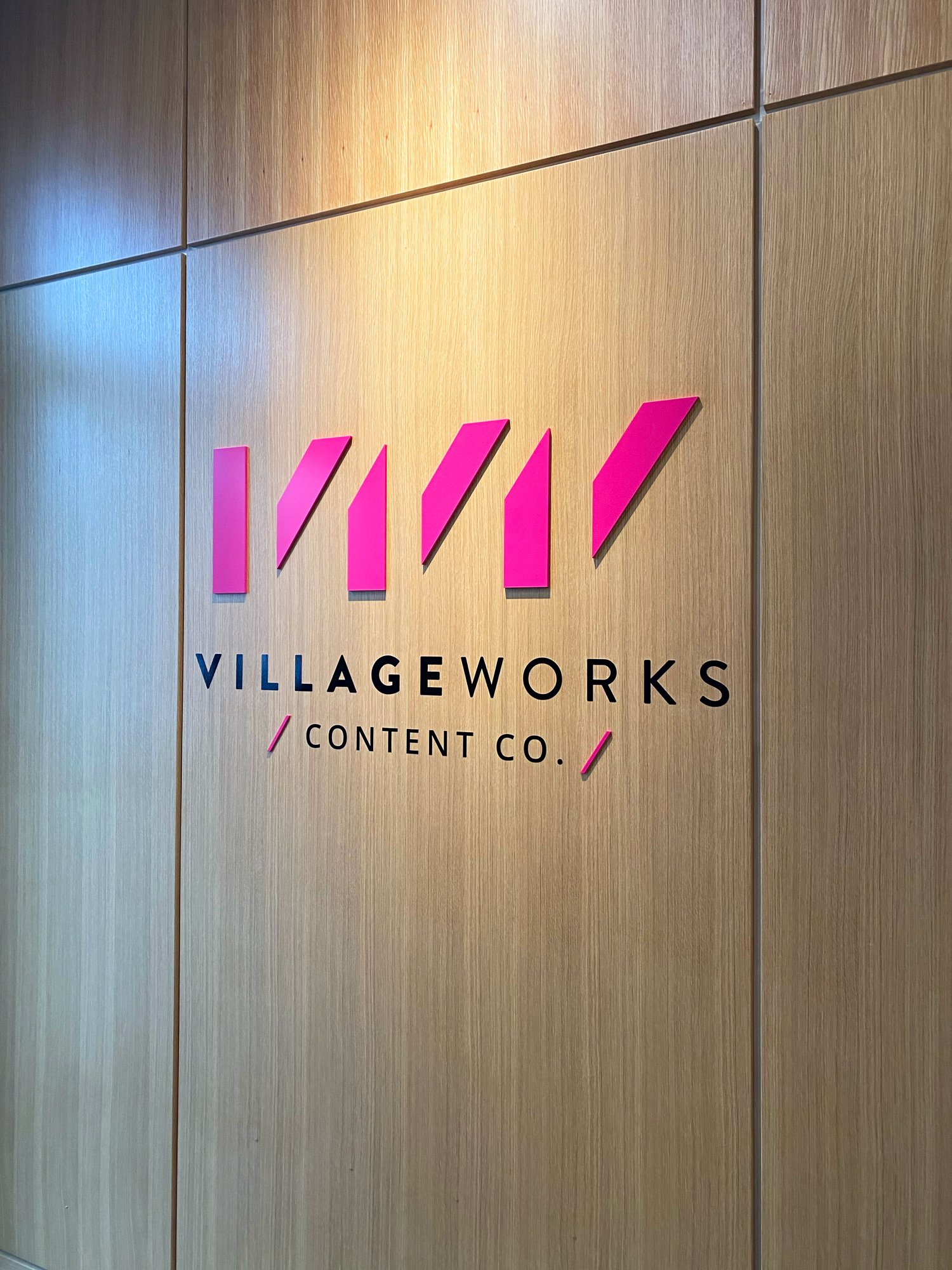
Inspired by the saw-tooth roof of their sleek new studio, the logo takes an abstract twist with negative space cleverly forming a repeating “V” shape. Look closer and you’ll spot a “VW”!
VillageWorks' colour palette bursts with creativity and innovation, featuring a bold pink that leads the way, complemented by playful touches of yellow, cyan, and black.
The end result is a brand that’s as fun and dynamic as VillageWorks itself.
SERVICES:
• Brand Identity
• Brand Guidelines
• Signage + Graphics
• Production Files