Bright Breaks
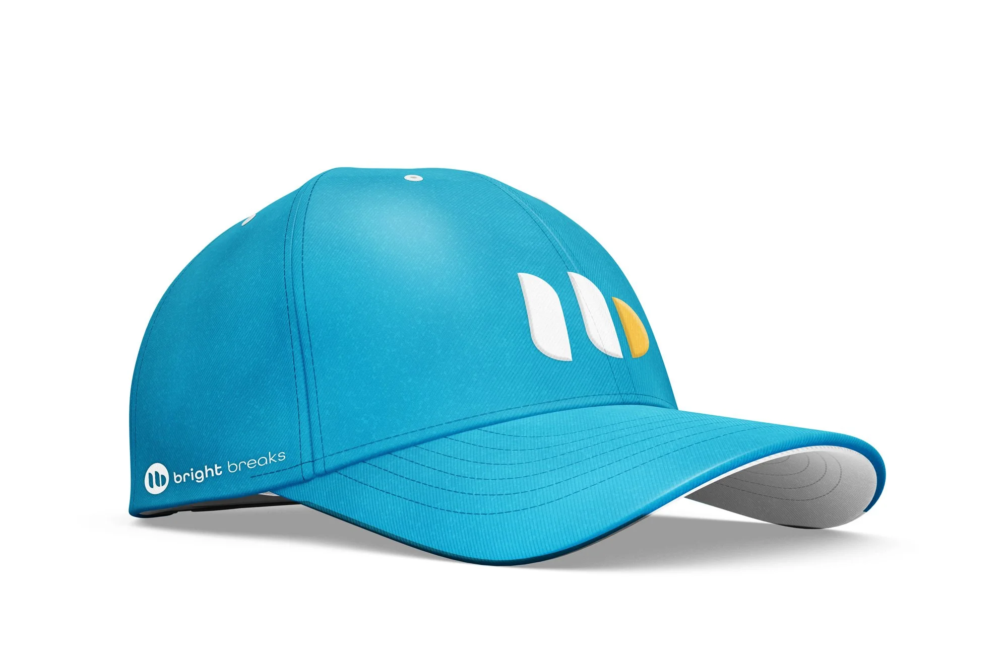
Sometimes a project doesn’t see the (bright) light of day, but the logo for Bright Breaks was a joy to create. Bright Breaks supports remote teams' well-being by providing an interactive space to take well-deserved pauses. Inspired by their original logo—a sun peeking through blinds—we reimagined it as a stylized pause button, incorporating the sun to form a sleek “b.” The design is simple and versatile, perfect for their app and social media, paired with a fresh palette of golden yellow, cyan, and vibrant secondary colours.
SERVICES:
• Brand Identity
• Brand Guidelines
• Signage + Graphics