Ghosn Group
Ghosn Group Development’s new leadership called for a refreshed brand identity—one that balances the company’s established confidence with a fresh, modern feel.
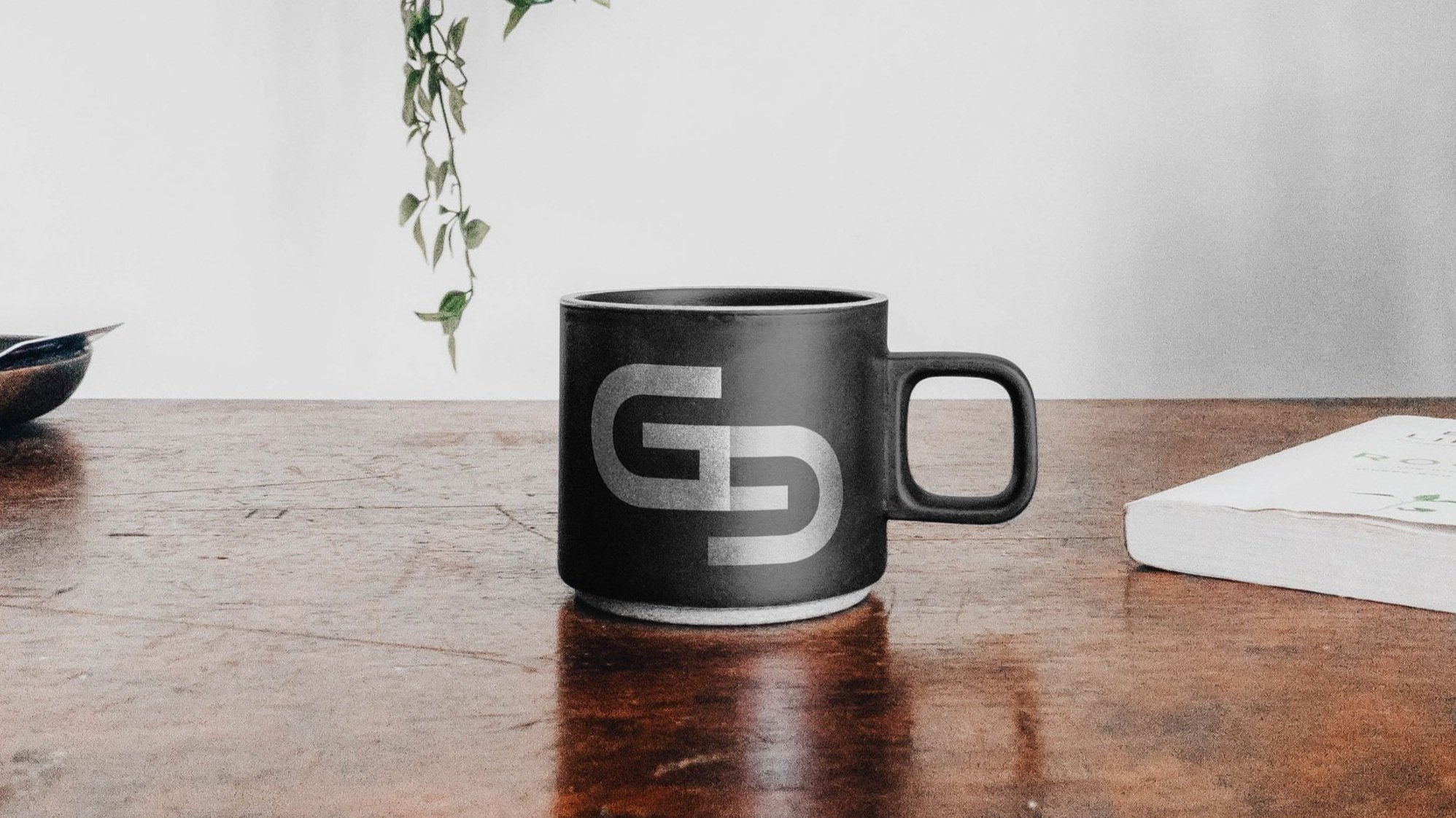
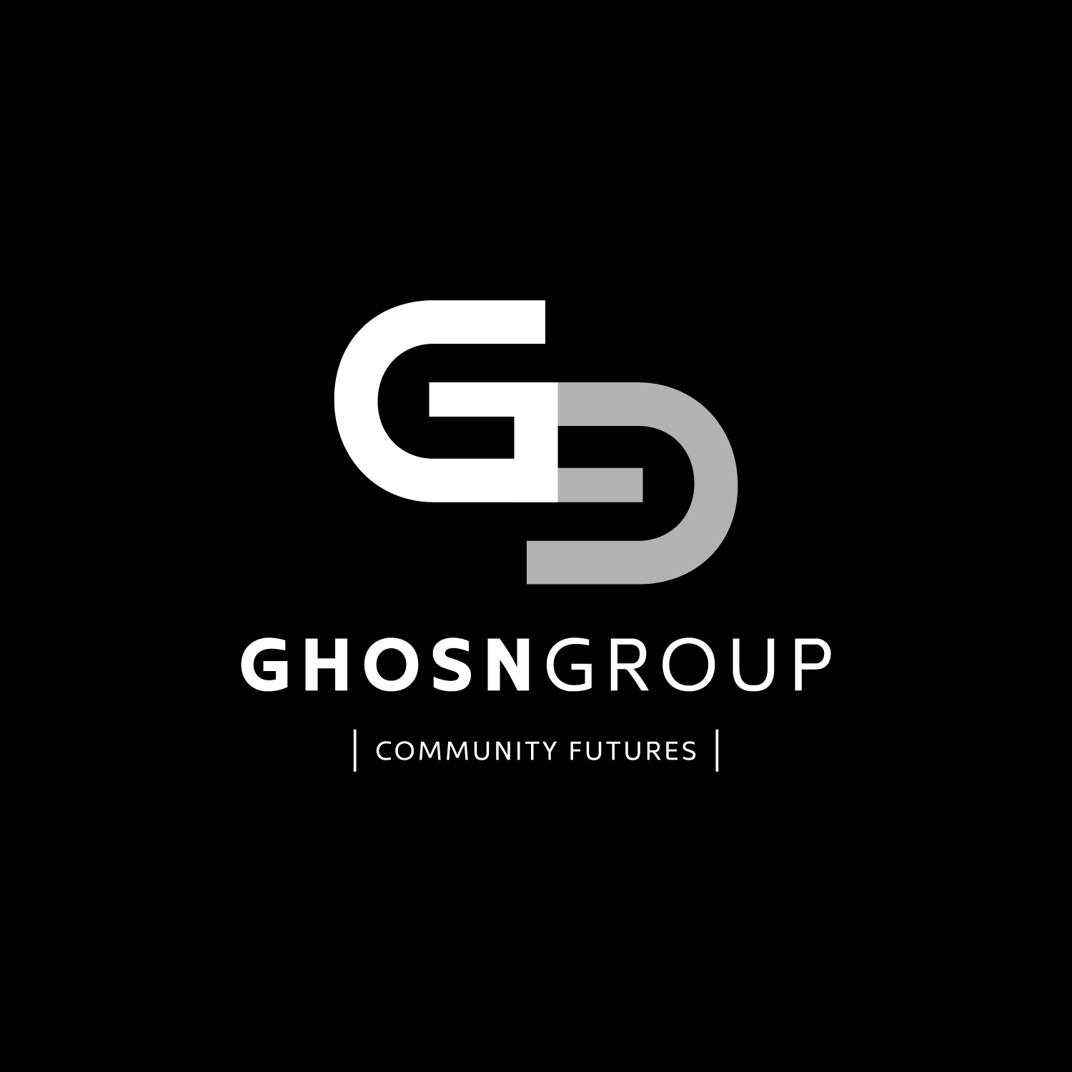
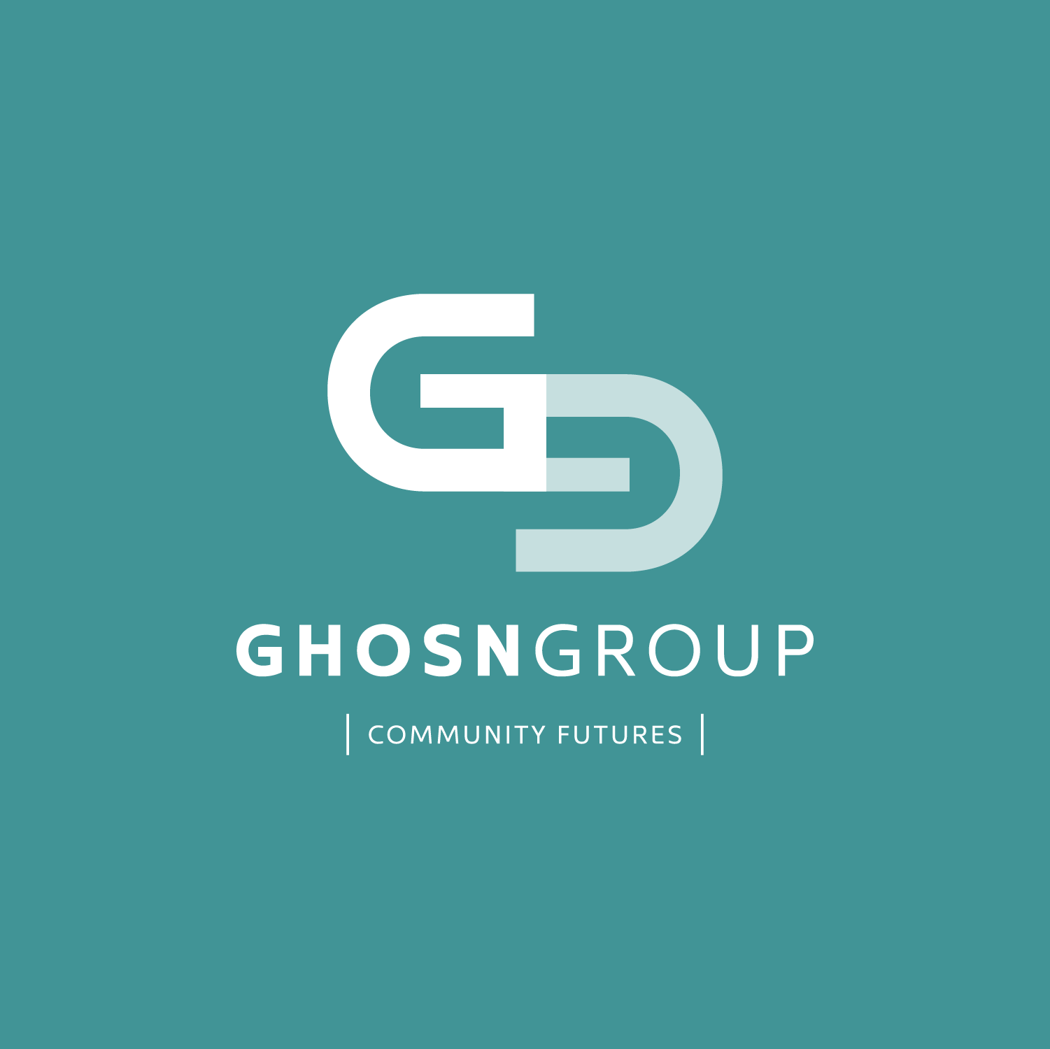
The result is a bold, symmetrical logo featuring an offset uppercase G and lowercase g, symbolizing a community chain link and evoking a plan view of a path or building form.This simple yet bold graphic was designed to stand out on construction hoarding, communicating to passersby that the Ghosn Group is ready to make an impact in the Halifax area.
SERVICES:
• Brand Identity
• Brand Guidelines
• Print + OOH
• Signage + Graphics
• Production Files