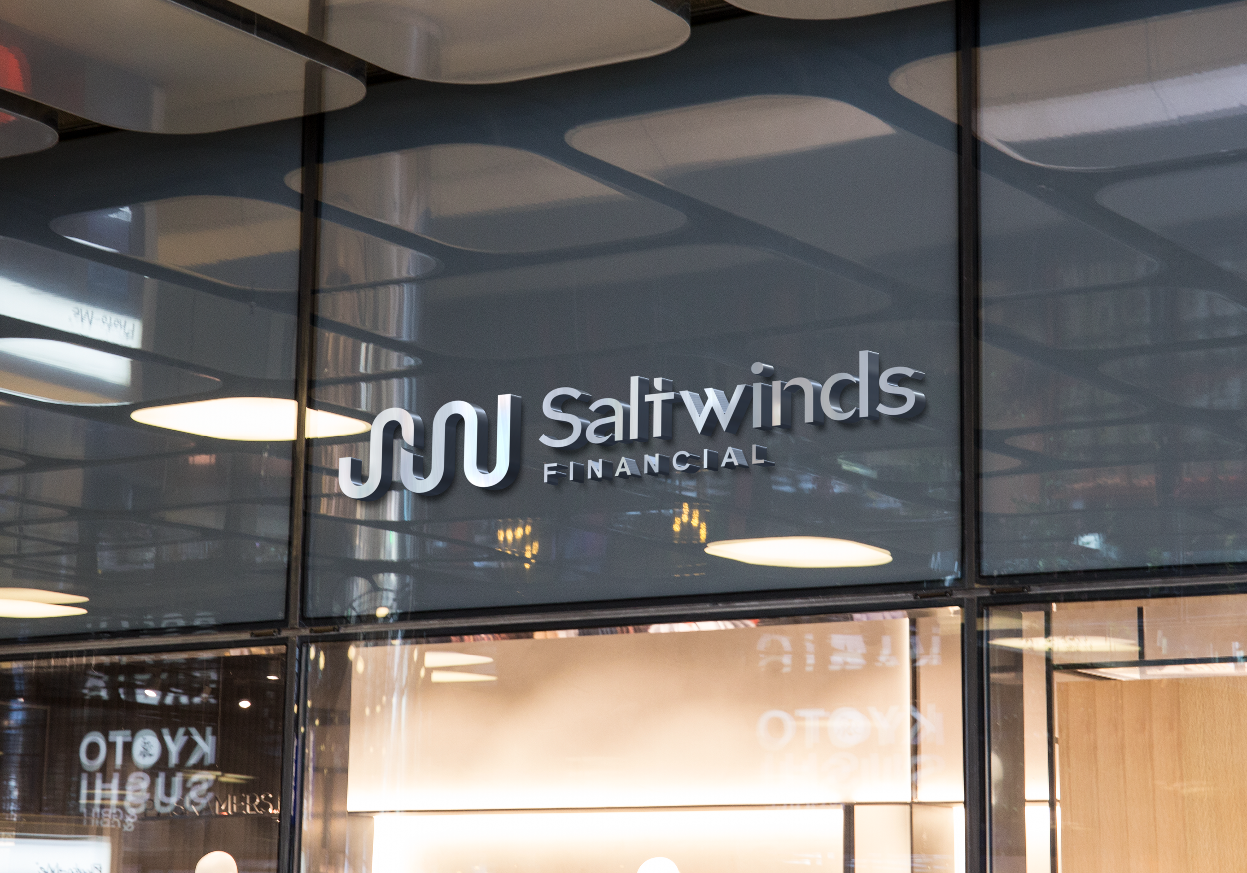
Saltwinds Financial
Two financial professionals approached me to help name and brand their new company. They wanted something inspired by the East Coast, without saying it outright, to keep the name inclusive and avoid limiting their reach, as they serve clients nationwide. The goal was to create a name that felt approachable and free from the stress often tied to money and insurance.
Saltwinds evokes calm, steady guidance. Like wind shaping the path of a sailboat, it symbolizes a trusted partner helping clients navigate toward their financial goals.
The curvy S and W form a wavy line, reinforcing the brand’s connection to wind and motion. This dynamic visual suggests adaptability, progress, and the flow of opportunity, creating a memorable, approachable identity.
SERVICES
• Naming
• Brand Identity
• Print + OOH
• Signage + Graphics
• Production Files


